

You might have noticed that Remind is looking a little different, whether you’re an avid app user or always logged in on your computer. If not, the secret’s out: Today, we’d like to introduce you to the new Remind logo—a key part of a bigger project to reimagine our brand.

Along with our new logo, we’re updating the look and feel for all of Remind, from Chat to Hub to Tutoring. And while our service and product experience aren’t changing, we’re excited to share what’s gone into our new brand and what it means for Remind.
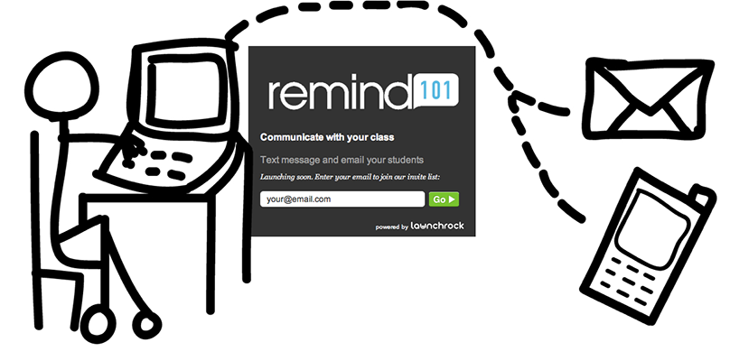
More than 10 years ago, when Remind sent out our first class notifications to students and caregivers, text messaging wasn’t widely recognized as a way for teachers to communicate with students. In fact, it was downright edgy. (If you have one of our vintage “I text my class” t-shirts, please send us photos.)
Now, of course, this perception has changed—for the better, we think. And, over the years, so has Remind.
Over the last decade, our platform has expanded messaging to include two-way communication, translation that automatically detects recipients’ language preferences, and even options for voice and video calls. We’ve broadened support networks to include schools and district communities as well as experienced, caring tutors who help students grow both their skills and their confidence.
We still believe that communication—and the relationships it creates—is at the heart of student success. We’re proud to run one of the largest free messaging services in education. But Remind has grown beyond a classroom texting service to become a communication platform for learning, and we decided that it was time to update our brand to reflect who we are today.
For the past year, we’ve worked with the wonderful team at Hoodzpah to bring our new brand identity to life. We’ll save the details of that process for another day, but here’s a quick overview of what you’ll start seeing on Remind:


*A little-known fun fact. But that’s what it’s been all along!
In the next few weeks, you’ll start seeing the new logo, colors, and illustrations appear throughout Remind. But, as we mentioned earlier, nothing about our product or service will be changing as we continue rolling out our new look.
The new Remind brand represents both our journey so far and our path ahead, and we’re excited to build on this foundation in the years to come. We hope you like it as much as we do! 💙

